Woodsprite Organic Body
WoodSprite Organic Body's packaging is so simply designed and relatively colorless that it struggles to grab potential buyers' attention, and it is easily forgettable, particularly when placed next to its competitors. My rebranding solution (which includes making the "S" in WoodSprite lowercase) keeps the new logo/branding simple, but brings it up to date by making it less stiff and more approachable.
This rebranding was done as a student project; it was not commissioned by WoodSprite Organic Body.
The revised logo captures the essence of Woodsprite through its whimsicle, yet sturdy, font, which I made numerous modifications to. The logo is used both with a background and without.
The typeface used for "Organic Body" in the logo and for all of Woodsprite's branding is Raleway. Raleway's "w" echos the strong diagonals of the "w" in the logo while providing its own whimsicle touch. Its wide, round characters suggest openness and honesty, and its many weights make it versatile.
The predominant color used throughout the brand is a warm, medium green, with white and a warm brown as secondary colors. The green and brown represent Woodsprite's organic quality while the white represents its purity.
The pattern used throughout the brand ties into the whimsicle nature of the logo and may be white on green or green on white. The "w" is used for stickers and also appears on the gift card and apron. Natural-looking, light-filled photography is also used throughout the brand.
Woodsprite promotes the use of recycled paper, so the business card, letterhead, and envelope are printed on Environment Papers PC 100 White, Smooth, 95 Brightness, 120 lb., 80 lb., and 70 lb. respectively.
The pocket folder holds the business card, letterhead, and envelope as well as a notepad, spiral notebook, stickers, and two product sample bags.
Also printed on recycled paper, the product packaging features close-up photography of the primary ingredients, as well as a consistent structure of typographic elements for each product.
Online customers will receive their products in a box clearly labeled with the distinctive "w" and white-on-green pattern, while in-store customers will receive their purchase in a reusable, cotton market bag featuring the Woodsprite logo on the front and the green-on-white pattern on the back.
The gift card packaging, gift bag and box, and apron each feature the clean, green-on-white pattern accented by the logo, a "w", or a green ribbon.
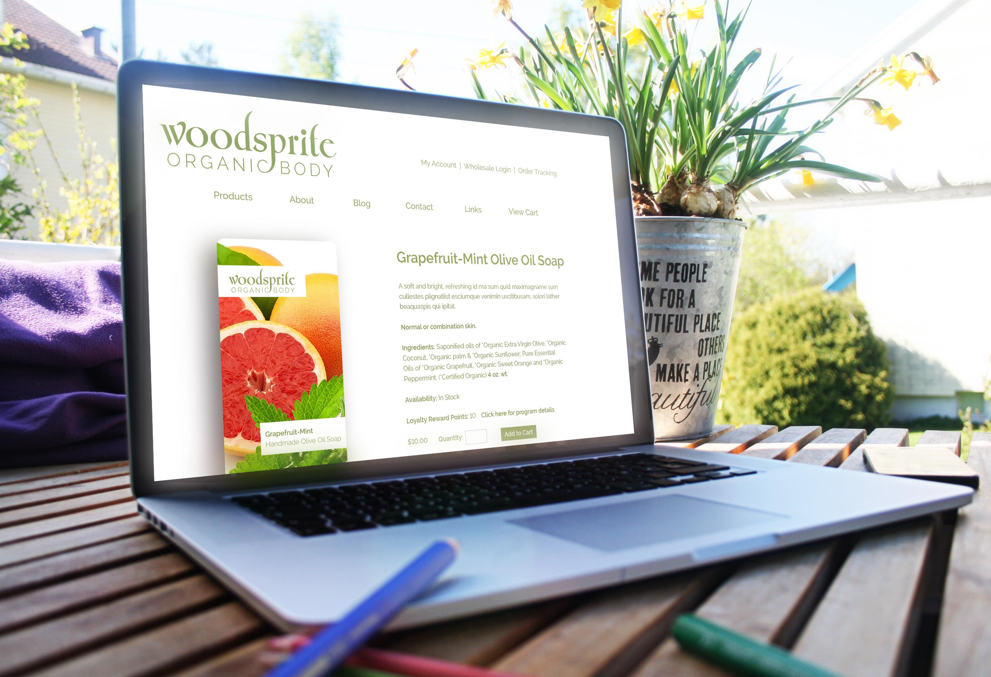
Combining the new logo, colors, and packaging, the website presents Woodsprite's products in an organized manner with plenty of white space for the eye to rest. The primary navigation is consolidated into the header and footer, with drop-down menus providing easy access to interior pages.